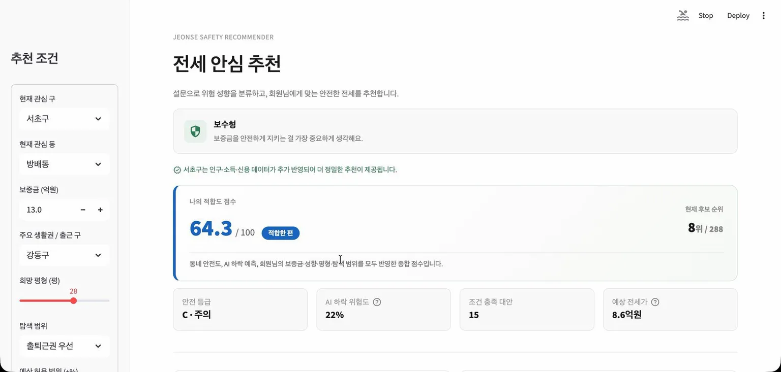
Demo
The problem
Jeonse is a Korean rental system where the tenant pays a large lump-sum deposit instead of monthly rent and gets it back when the lease ends. If home prices fall below the deposit, the tenant can lose part of it.
Price data for Seoul apartments is easy to find. Judging whether a specific home is safe is left to the renter, and the data needed to judge it is scattered across several sources.
We started with the question “is this home safe?” and changed it within a day to “where would be safer for me?”. A grade on its own, something like “jeonse ratio 78%, grade B”, does not tell a renter what to do next. They need safer options inside their budget and area, and two renters with different tolerance for risk should not get the same ranking.
What the app does
The renter first answers six statements on a five-point scale, such as whether they would accept a longer commute for a safer deposit. The answers place them in one of three profiles: conservative, moderate, or adventurous.
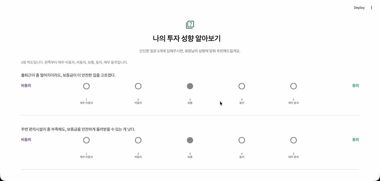
The six-statement survey that sets the renter’s risk profile.
They then enter the neighborhood they are considering, their deposit, where they commute to, and the apartment size they want. The app scores that neighborhood for them and ranks it against all 288.
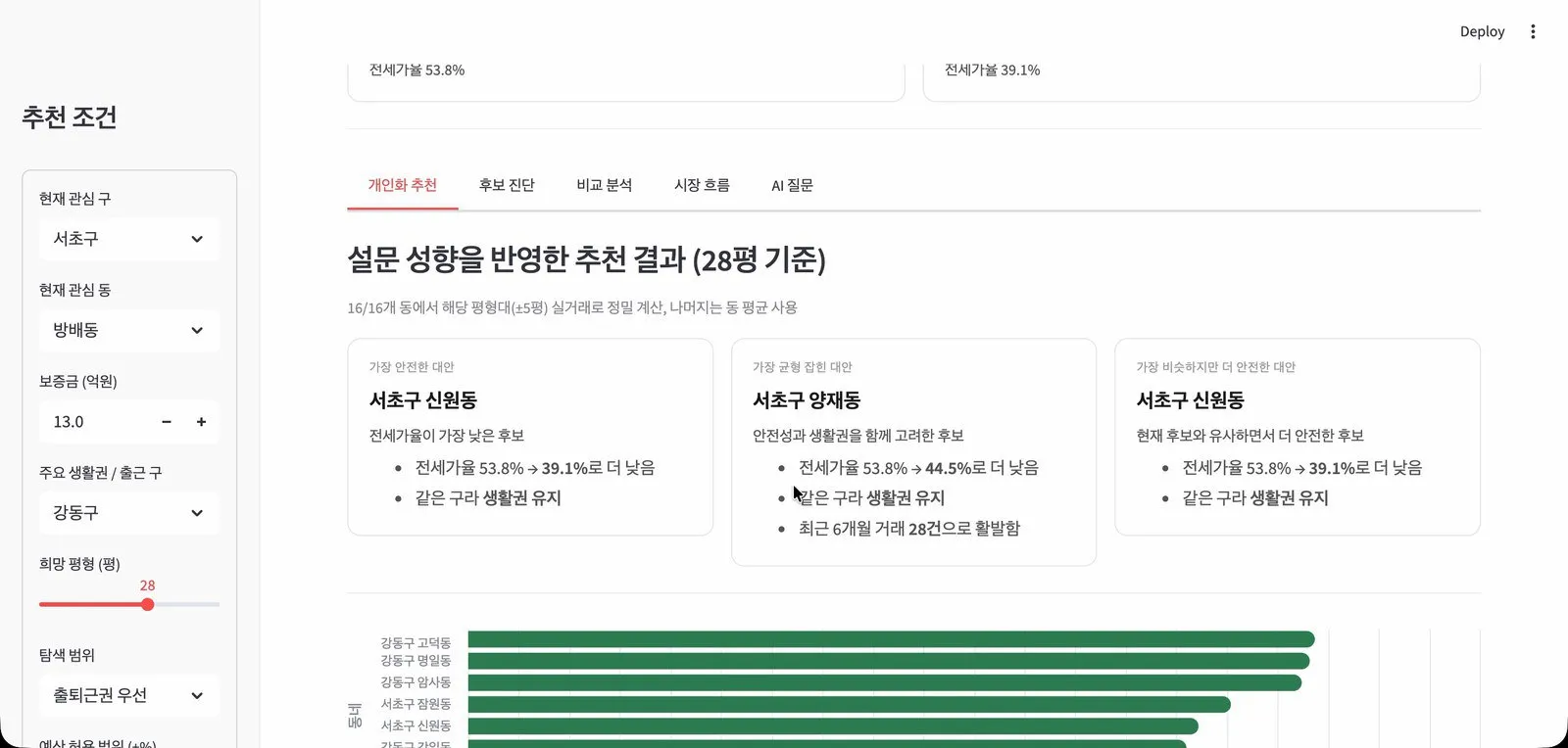
Three recommended alternatives, each with the reason it was picked.
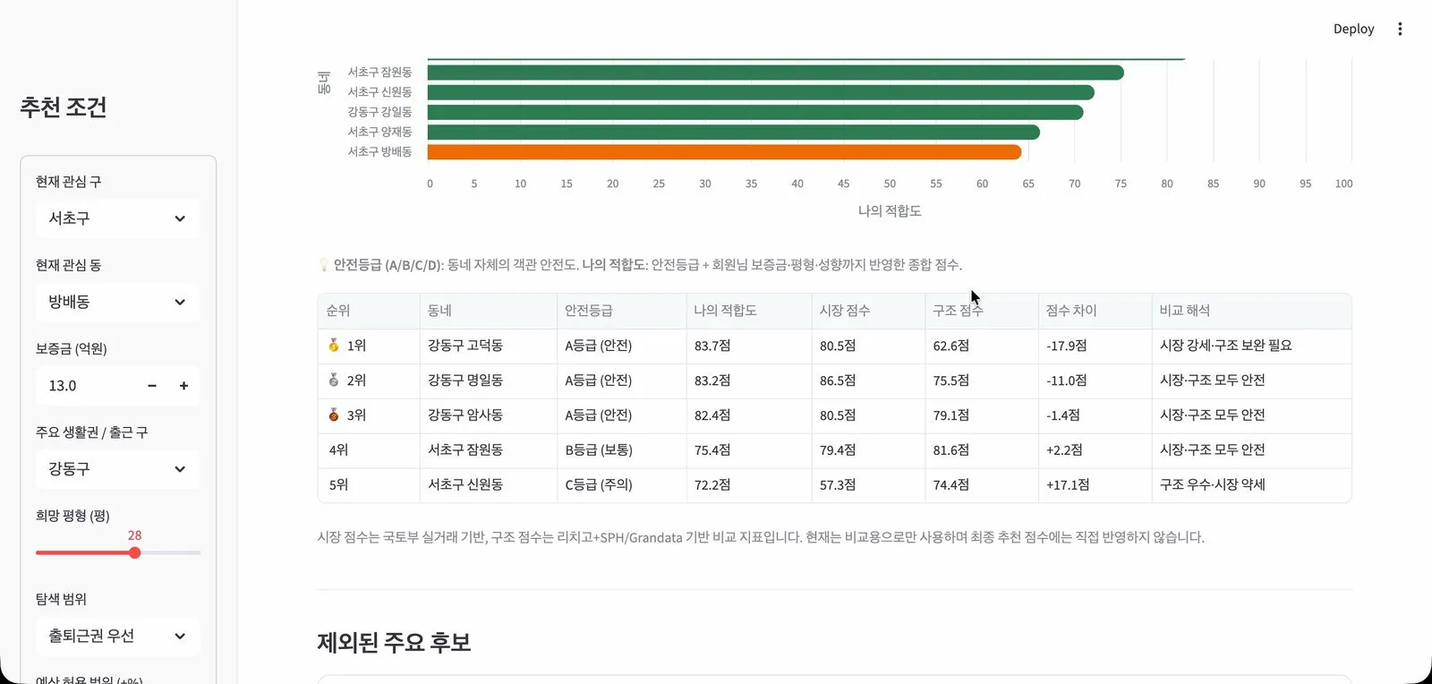
The full ranking, with each neighborhood’s safety grade and fit score.
How it is built
I built the data loader, the scoring engine, the survey, and the first version of the app. My teammate built the machine learning model, the AI features, and the final interface. The sections below say which is which.
The data loader
The first version of the app, on April 5, read from Snowflake Marketplace data and was hard-coded to three districts. On April 8 I replaced that with a loader that pulls apartment sale and rent records for all 25 districts from the government’s real-estate API. The views the app queries kept the same shape, so the app did not have to change.
The loader walks through every month, district, and page of results. Three decisions shaped it:
- Failed calls are retried. Rate-limit responses, server errors, and network errors are retried up to five times. The wait starts at 1.5 seconds and doubles each time, up to 20 seconds.
- Every record gets a key. The key is a SHA-256 hash of the fields that identify a deal: district, date, apartment, lot, area, floor, and price. Records load into a temporary table and are merged into the main table on that key.
- Running it twice is safe. Because of the merge, a second run updates existing rows and adds only new ones. This mattered more than I expected, since the loader has no checkpoint and a failed run starts over.
On the Snowflake side, the raw tables keep each record as it arrived. A clean layer drops cancelled deals and computes price per unit of floor area. A monthly layer takes the median for each neighborhood and month, and that is what the scoring engine reads.
The scoring engine
The engine first removes neighborhoods that are over budget, outside the search area, too thinly traded to judge, or priced with a jeonse deposit above 90% of the sale price. It then scores what is left.
The components I wrote are:
- Loss exposure: the renter’s deposit multiplied by how much jeonse prices in that neighborhood moved over the past 12 months.
- Price cushion: the gap between the sale price and the jeonse deposit, as a share of the sale price. A wider gap leaves more room before a price drop reaches the deposit.
- Budget fit: how close typical deposits are to what the renter can pay.
- Commute: higher for neighborhoods in the district where the renter works.
The risk profile changes how much each component counts. For a conservative renter, loss exposure counts 1.4 times as much as for a moderate one. For an adventurous renter it counts 0.7 times as much.
The final score is 80% this rule-based score and 20% my teammate’s model. My teammate also rewrote how the survey answers map to a profile and normalized the weights.
I also wrote a backtest. For each neighborhood and each starting month, it looks at the following 12 months and records the worst drop and the ending change in jeonse prices, then turns that history into a resilience score. In the final app it only breaks ties and explains why a neighborhood was excluded. It never became a headline number.
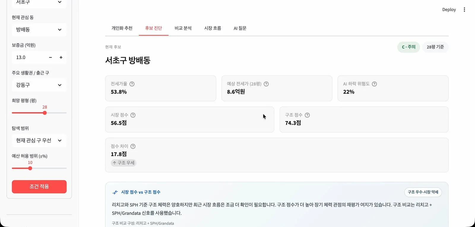
The detail view for a single neighborhood.
What my teammate built
My teammate trained a gradient boosting model that estimates the chance of jeonse prices dropping 5% or more within six months (ROC AUC 0.738). They also built the three Snowflake Cortex features, which write plain-language explanations, a market briefing, and answers to free-form questions. They priced neighborhoods by apartment size and redesigned the interface. Their two-pass loading cut the wait for first content from about 15 seconds to under 1.
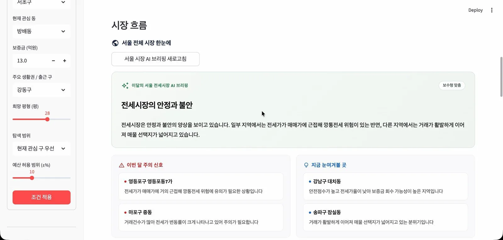
The market briefing, generated with Snowflake Cortex.
What changed along the way
- April 5: diagnosis became recommendation. The app stopped grading one home and started suggesting better ones.
- April 8: three districts became 25. The government-data loader replaced the Marketplace-only pipeline.
- April 11: the survey scale got simpler. I removed a step that inverted the five-point answers and added labels to both ends of the scale.
- April 11: the briefing became on-demand. I moved the AI market briefing behind a button so that pages do not wait for it.
- April 12: search area started to matter. Changing the search area barely moved the scores, so I added a term that makes the change visible.
- April 12: AI text got a fallback. I added a cleanup step for the generated explanations and a rule-based explanation for when generation fails.
What I would fix next
- Loss exposure treats a rise like a fall. It uses the size of the 12-month price change without its direction.
- Some inputs cover three districts. The population and income data we used exists for only three of the 25 districts.
- The loader cannot resume. A long run that fails starts from the beginning.
- The backtest is hidden. It should be shown to the renter, since past drops are the most concrete evidence the app has.